Create reusable content for Deliver Designer templates. Add HTML and variables to control the values that mailing authors can change.
🔑 Required permissions: Deliver, Deliver Templates
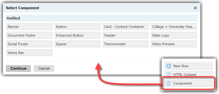
Components are the building blocks of a template. They can include a header, a footer, logos, and buttons.
Components enable users to choose styling options from a list you provide. For example, a header can be designed to offer a selection of one of two colors.
Components can be locked to prevent editing by other users.
Templates and components can be previewed to ensure that the email renders as desired.
Templates and components can be reused to prevent wasted time and duplicate work.
Variables
Components are shells that include HTML and configurable elements called variables.
There are four variable types:
Text (String): A free text element
Number (integer): A whole number
True/False (Boolean): A yes/no value stored as a "1" or "0"
Select (List): A single-value list of prompts
Variables are controlled by Liquid markup. As such, working in Deliver Designer templates requires a familiarity with the fundamentals of Liquid markup.
Create a header component
This example creates a header with three values that you can configure:
Background color
Font
Header text
1. Create a new component
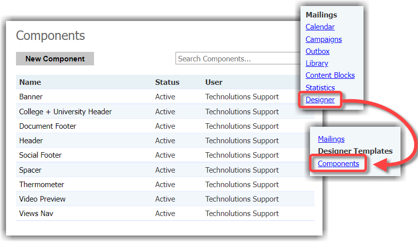
From the main navigation, select Deliver.
On the right side of the page, select Designer. The Designer Template page appears.
On the right side of the page, select Components. The Components page appears.
Select New Component. A pop-up appears.
Enter the following configurations:
Name: Enter a unique, descriptive name.
Description: Enter a description if desired.
Status: Active
Folder: Keep components organized in a clear folder structure. Select Other to create a new folder.
Select Save. The component editor window appears.
Follow along with the following example by selecting Edit Component.

2. Create variables in the source editor
Select the Source button in the WYSIWYG editor. Paste the following line of HTML between the tags:
 <div style="background:{{background}};font-family:{{fontface}};text-align:center;color:white;padding:25px;">
        {{header_text}}
        </div>
The HTML contains merge fields for background, fontface, and header_text. These elements will be populated by creating corresponding variables.
3. Configure the background color variable
First, let's create the variable for background color using the Liquid markup variable background.
Select OK to close the Source window.
Select New Variable at right. A pop-up appears.
Configure the following settings:
Name: Background Color
Liquid markup variable: background
Description: Enter an optional description.
Required: Select the checkbox
Type: Select (List)
Prompts: Similar to overriding system prompts on a form, we will add a display name, followed by a caret ^, and then the hex code for the desired background colors:
Blue^#00669eGreen^#99cc00
Default value: Blue.
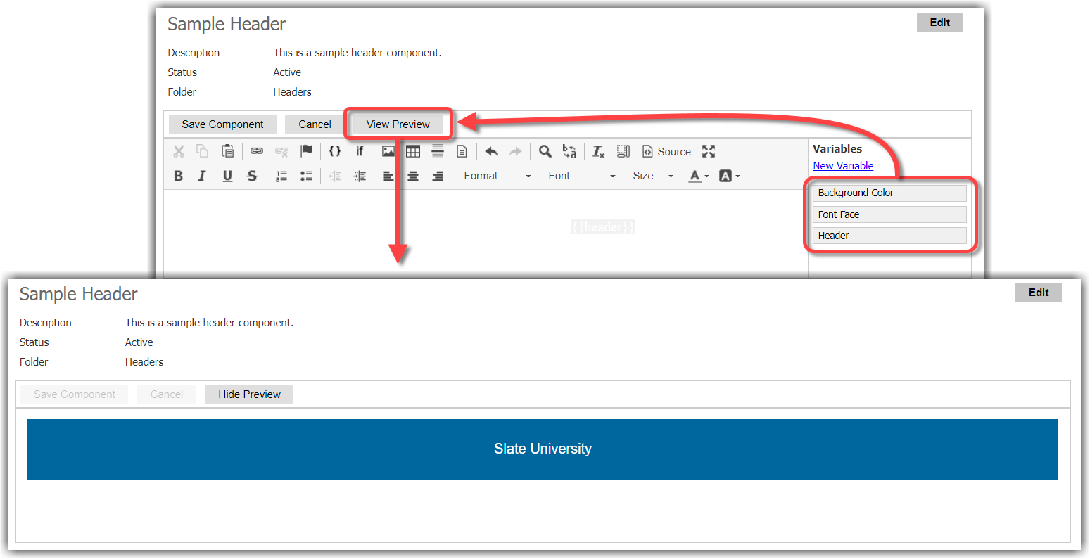
Select Save. The new variable Background Color appears in the list at right.
💡 Tip
When using colors, HTML color names can be used along with RGB hex colors.
4. Configure the font variable
The second variable we will add is for the font:
Select New Variable from the navigation at right. A pop-up appears.
Configure the following settings:
Name: Font Face
Liquid markup variable: fontface
Description: Enter an optional description.
Required: Select the checkbox
Type: Select (List)
Prompts: In this case, we do not need to override the prompt values since the font name is the same as the desired value.
Arial
Times New Roman
Default value: Arial
Select Save. The new variable Font Face appears in the list at right.
5. Configure the default header text variable
Finally, we will add the default text for the header:
Select New Variable from the navigation at right. A pop-up appears.
Configure the following settings:
Name: Header
Liquid markup variable: header_text
Description: Enter an optional description.
Required: Select the checkbox
Type: Text (String)
Default value: Slate University
Select Save.
6. Preview the component
With all three variables in place, we can now select View Preview to display the variables in action:
Create additional components as needed. Then add the components to a Deliver Designer template.
⭐ Best Practices
Think about mobile usability when building each component.
Since users will likely not have the Deliver Templates permission that allows for full customization of the template, each of the components—as well as the template itself—should be mobile-friendly from the start.
To read more on optimizing Deliver communications for mobile audiences, check out the article on mobile responsiveness.
Example: Use the header for different messages
Use the header component above for a campus visit invitation or an alumni event announcement. Keep the same HTML structure. Change the variable values for each use of the component.
Variable | Campus visit invitation | Alumni event announcement |
|---|---|---|
Header text ( | Visit Slate University | Welcome back to Slate University |
Background color ( | Blue | Green |
Font ( | Arial | Arial |
The Blue and Green options come from the Select variable configured in this example. The header text comes from the Text variable. The component HTML keeps the text centered and white.
Add the component to a template with the instructions in Build a Deliver Designer Template. Set the variable values when you configure the component. Add the event date, location, and registration link in a separate HTML Content section.
To let mailing authors change the header values, select Allow Customization for the column that contains the component. See Configure the mailing to change those values in a mailing.